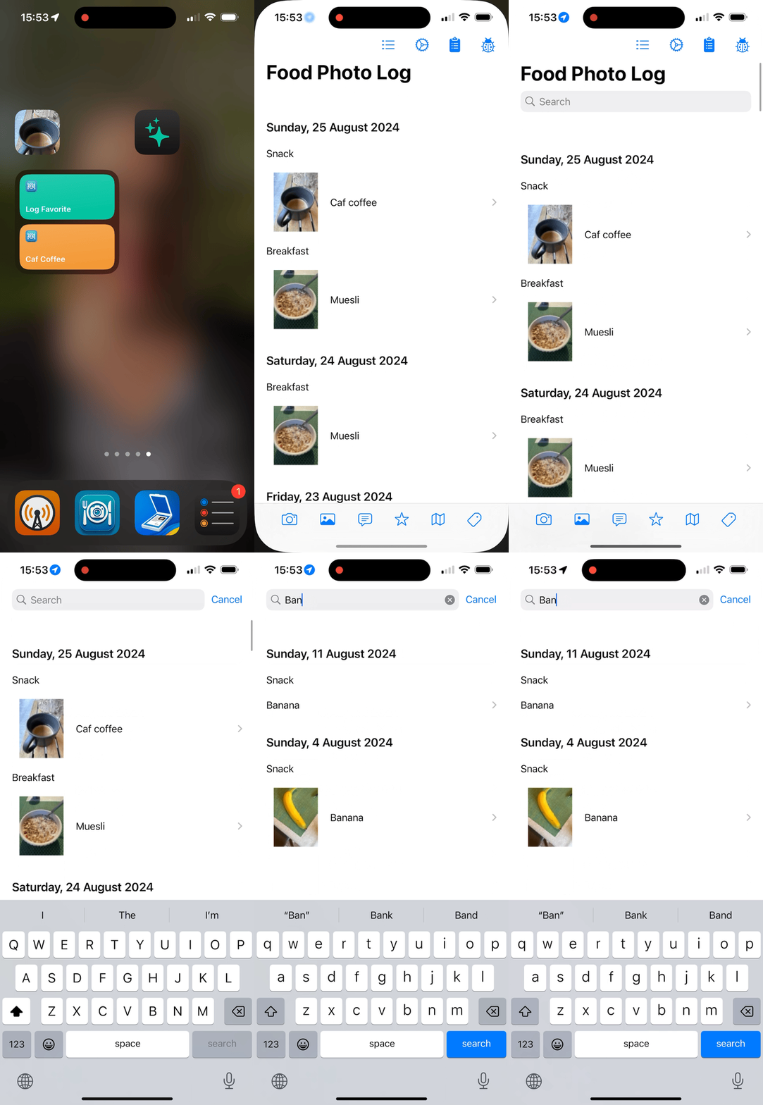
Making .searchable text only show if you scroll a List
In my FoodPhotoLog app I want to make the content searchable, but I don’t want the search field cluttering up the UI unless the user scrolls down slightly to expose it.
If you use the .searchable modifier outside a List then the search text box appears all the time. If you use it inside the list then where do you put it? You get janky behavior if you attach it to each element.
The solution I’ve found is to create an empty element at the top of the list with minimal height:
List {
    EmptyView().searchable(text: $searchText).hidden().listRowSeparator(.hidden).frame(height: 1)

    ForEach(dayGroups) { dayGroup in
        Section(header: Text(dayGroup.dayString).matchedGeometryEffect(id: dayGroup.id, in: animation).listRowSeparator(.hidden)) {
            ForEach(dayGroup.occasions) { occasionGroup in
                Section(header:Text("\(occasionGroup.occasion)".localizedCapitalized)
                    .matchedGeometryEffect(id: occasionGroup.id, in: animation)
                    .listRowSeparator(.hidden))
                {
                    if showGrid {
                        ItemGridView(occasionGroup: occasionGroup, animation: animation, navigationPages: $navigationPages)
                    } else {
                        ItemListView(dayGroup: dayGroup, occasionGroup: occasionGroup, addItem: addItem, addOccasionGroup: addOccasionGroup, animation: animation, navigationPages: $navigationPages)
                    }
                }
            }
        }
        .headerProminence(.increased)
    }
}
.environment(\.defaultMinListRowHeight, 1)
Ignore most of the code except for the first and last lines - those are the two key lines here:
- The EmptyView at the start of the list, which has the
searchablemodifier applied, hides the list separator and is one unit high; - .environment on the last line, that allows list elements that are one unit in height through .defaultMinListRowHeight.
